Sunday, March 27, 2011

Back to Basics

Yes, I do have enough fabric to last me the rest of my lifetime. But I can't help going out rummaging around now and then. My favorite shopping spot is the Goodwill bins, the final stop when things don't sell at Goodwill and are headed to landfill.

These are the beauties I rescued this time:

And I can't just let bits of hand embroidery go to the dumps:

Then I headed to the Senior Center rummage sale and found these unique bits:

Even a cutter quilt of old fabrics priced at $1:

I confess, I can't pass by this bright 60s fabric without buying it. Probably because I made so many clothes out of this stuff when I was a teen. I have a whole bin of it, and it's so bright, I don't know what I'll do with it. But someday....

I'm back to quietly stitching bits of fabric together by hand, and it feels really good.


Monday, March 21, 2011

Wrapping up Pamela Allen class


I'm finally finishing up my lesson #3 from my Pamela Allen class. This one was about using stripes and patterns to accent design and also about steering away from pure bright color. It was a fun one, and a great wrestle with composition to work with so many bits, but I've pretty much decided that pictorial pieces are not my style.

Here's my first attempt. I was thinking about little Mexican villages that are these burst of color in the middle of drab surroundings. I wasn't trying to be very accurate, thus the peaked rooftops that you wouldn't find in Mexico.

Here is Pamela's revision. She recommended opening up the front for more space around the church and building a wall around it.


I made a number of changes and still see other things I would do differently (change the too busy house in the background, put the stained glass window shape back in), but I've lost my steam on this one and ready to move on.

Pamela is teaching more online classes this year and has now listed some on her website. I highly recommend them!

Over on Portland Art Collective, Tammy is giving away one of her beautiful Victorian tassel dolls, all dressed for spring. Leave a comment here to enter.

Tuesday, March 15, 2011

Bauble Break

Sometimes I crave total silence, and this was one of those times. Living with a husband, 2 teenage boys, and a demanding bulldog, I often feel like I never have a solid chunk of time to focus on what I want to do. So for my birthday this year, I gave myself a blissful retreat--alone-- to the beach.


For 3 nights I painted and read, took walks and stitched.

A perfect place to work on simple baubles:


Sunday, March 6, 2011

Pamela Allen lesson #4

I'm still working on my lesson from week #3, so I'll post that later. Here's a little exercise we did from week 4. The focus for the week was on negative space, and we warmed up by doing a chair formed from the negative space. In other words I started with the tan and black lined fabric and cut the negative space from the colored fabric to form the chair.


It was very challenging even though I've done these sort of exercises in drawing already. I was so focused on getting the right shapes that I didn't give any thought to composition. Here're Pamela's suggestions to improve the composition of the piece:

My main problem was lining up fabrics right along the rungs or right with the seat line. And I always tend to crop closely while she allows more space around an object. I do like these changes she suggested.

The main part of this lesson was to do the same technique of using only negative space but now of a woman sitting in a chair. After one very dismal attempt, I decided it was way too tedious to try to rework, so I'm abandoning it and going back to work on lesson 3. I got the lesson of the importance of negative space, but can't say I enjoyed it.

Sunday, February 20, 2011

Pamela Allen exercises--part 2

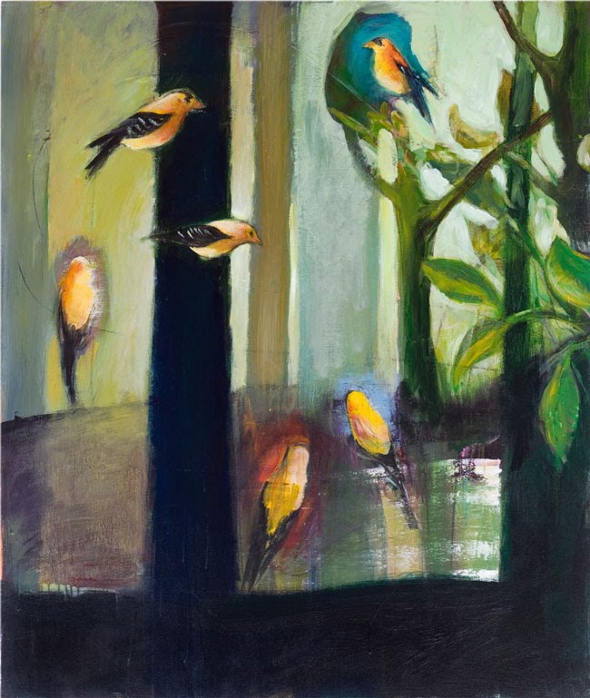
Pamela gave us an alternative exercise for those who didn't want to venture into the complimentary color one. I needed more practice (and still do!) with composition, so I gave this one a quick try.

The assignment was to pick two colors and do a whole composition using only those, focusing on different values and intensities. The color didn't hang me up, but the composition did.

My thoughts here were that I wanted a big, bold contrast between the citrus and the blue bowl. I wanted it strong and graphic, yet anchored in a setting. I came up with this:


Pamela said the composition and scale made it visually confusing--the bowl is so much bigger than the chair, and the strong diagonal gives a strange perspective. Also the bowl is too big and cramped in the space, and there needs to be more variety in shapes to keep it interesting. Here is her revised version:

I do like the additional space she added. The bowl still really pops but is anchored much better in the space. And I really like how she kept the right half quiet, keeping all the emphasis on the bowl. She mixes up patterns, like putting the stripes of the floor in different directions to keep things interesting.

So now I'm struggling with how to do scenes that are not realistic, yet don't throw the viewer by being visually confusing. Not sure if pictorial pieces are ever going to be my thing, but it's a great learning experience!

For those of you who are interested in Pamela's classes. She only takes 20 in her class and has been teaching only one online class a year. Her classes fill immediately with return students, so there are seldom openings. But the good news is--she is considering repeating some of the classes more often during the year to allow in new students. If you are interested, email her at allen5@sympatico.ca

On another note, Stephanie is giving away one of her carved hearts over on the Portland Art Collective blog. Go here and leave a comment to enter. I have several of her carved pieces and love them!

Friday, February 18, 2011

Pamela Allen workshop

I am really thrilled to be taking another Pamela Allen online workshop this month. I got so much out of it last year that I couldn't resist another round, this one focusing on color and pattern.

We started by doing the same exercise we did last time, but since I wasn't hugely successful the first time, I was happy to have more practice. We chose a painter whose colors attract us, and then we tried to copy those colors in fabric.

I chose this painting by my favorite Portland artist, William Park.


And my fabric version. I would have liked to have found a bit brighter, bluer green for the background, but this was as close as I had. It's a great challenge and teaches so much about putting together colors you might not naturally go to.

Next we take those colors and create our own small composition with them:

Pamela critiques each step of the way by photoshopping in changes she recommends. A fabulous way to see what works! My first exercise was fine. On this one she suggested a little more modeling with a few more pieces on the trees and mushrooms. I really like the added depth it gives to the mushrooms especially.

Our week 2 assignment was to take another painting we are drawn to and then recreate it in all its complimentary colors. I chose this Matisse:

Warning--this gets really ugly! The compliments make her look ghoulish. But I was really happy that Pamela said I had them all right. It's a huge challenge because you are not only thinking about color compliments, but also trying to find the correct values and intensities in that compliment. And translating from paint to fabric carries its own special challenges. A very worthwhile--but exhausting-- exercise!

You can see the exercises from last year here, here, here and here, and I'll be posting more as the class continues.

Monday, February 14, 2011

Happy Valentines Day!

We had a Valentine's swap at our art group meeting this month, and this was my card. I wanted to see if I could take Beryl Taylor's reverse applique technique and use it in a shape other than a circle. It works fine, but I still think there are much easier ways to get a similar effect, so more play is needed.