Monday, August 17, 2009

Refueling

Life snuck up and sapped me of all creativity for the last week or so. The best I could muster were a few pages in my Inspiration book. My friend Martha shared her wonderful design journal with me recently, and I was inspired to start one of my own. This is just the bare bones beginning of flipping through magazines to pull out what caught my interest, good mindless fun when the energy level is low.

Lines:

Nature patterns:

Irregular grids:

Palettes:


Wednesday, August 5, 2009

Pod Painting

I finished another in my pod series, and this one is probably my favorite so far. It's rare for me to be really, really happy with one of my pieces, but this one does it for me (at least it does this week). I like the amount of negative space in this one and the way it is just one step away from being abstract. The focus on the solitary pod captures my mood for the month of July when I was retreating from all things social.

For those of you interested, here is the process I use, more or less--it's hardly a science.

I use 5 colors: Cad. red, Alizarin Crimson, Cad. Yellow Med, Cerulean blue, and Ultramarine blue, plus Titanium white. I start by loosely getting paint on the canvas. It's very watered down at this point and I let the drips occur naturally.


I decided I liked the canvas better flipped upside down, so rotated it and started loosely defining a pod. At this point, I knew I liked the idea of a solitary pod with lots of negative space all around it.

Bill Parks taught me to totally shake things up when I feel stuck. It has to be with big gestures--adding a bright color, painting out an entire area, something to completely redefine the painting. I didn't know where I wanted this to go, so I turned the canvas upside down again. I started toning down the canvas with grayed colors.

I started liking the composition, so began focusing on value and simplifying some areas. At this point I mix my paints with either matte medium or glazing medium to give them more richness.

Last steps are defining detail, intensifying or de-intensifying colors and values, and thinking about edges.

And close up:

Wednesday, July 29, 2009

Hearts and Heat

We have been having a freaky heat wave in Portland with temperatures of 106 degrees. Luckily we have air conditioning, so all I've been doing is sitting home and stitching lately. Not such a bad thing.

I've been working on a bunch of hearts. I first started using some fabric I overdyed:

Then found I really liked the weight of designer fabric samples for the base:

The above hearts are large, about 12" high and I've also made smaller 5" hearts:


The materials are about 95% recycled--designer fabric samples, reclaimed and dyed clothes and linens, even the batting came from Goodwill. The only new thing I can't resist is the shine of a bit of silk here and there.


Monday, July 20, 2009

Experimental Drawing

I took a 2 Day Experimental Drawing workshop this weekend with Nicole Gibbs at Oregon College of Art and Craft. The idea was to spend 2 days drawing fast and furiously to produce over 100 drawings and our own visual vocabulary to work with in the future.

Nicole had lots of exercises for us to do--we drew to music and to words. We created blobs from ceramic slip or salt water and drew with those. We worked alone and collaboratively. And we worked fast and faster as we covered the studio wall with drawings:

When I got home, I went through my stack quickly and pulled out the ones that most spoke to me. I put them up on my studio wall:


I think what surprised me most in looking at all my drawings in a group was how drawn to delicacy I am. Lately I've been thinking more about white space and even have been gathering very frayed pieces of white fabric, thinking about a project. That seems to come through in quite a few of my drawings:

At the end of the workshop, I joined some of my favorite drawings together with stitch.


Wednesday, July 15, 2009

Pod Series #3

I've been painting a couple more pieces in my pod series. This one has been sitting on my easel for a few weeks without me wanting to make any changes, so I think it's done. I really like the fading in and out quality of this one.

I've been following the advice from William Park's workshop. I didn't start these with thumbnail sketches or value studies, instead I let the painting evolve as I go, adding layers and layers and changing composition and value as the painting develops. These are large 30"x40" canvases so lots of room for changes. I love seeing where it ends up.


And a couple close-ups:


I keep meaning to photograph it along the way to show the many changes it goes through, but then I get excited about painting and forget all about the photography. I did get some steps on the next one. When I finish it, I'll post them.


Sunday, July 12, 2009

Banners

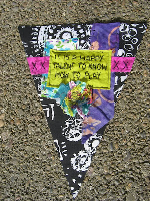
My art group held our banner swap this week, so I can now show what I've been playing with lately. We each made 17 banner pennants for exchange. I made mine out of recycled, vintage and hand-dyed fabrics, all similar but each slightly different. To see the banners that various members contributed, go here. It's always fun to see what everyone comes up with.


I find that I work so long in a certain color combo, here brights on black and white, then I need a new direction. I'm now hungry for deeper tones for a while.

Don't miss this very cool give-away my friend Cindy is offering on her Artful Journey blog. She has been collecting vintage fiber and paper goodies for some time and sells the most marvelous packets at her retreats only. You'll want one of these.


Sunday, July 5, 2009

Confections


Here are some goodies I've been making for other projects. There's nothing I love more than playing with stacks of texture and color.


They looked so delicious, I put them all on a silver tray.