I am swamped trying to keep up with my online class. I am loving every minute of it and want to stay on top of it to take full advantage of all the fabulous critiques--definitely the best part of the class. We post all our work online and Pamela critiques every piece, so you not only learn from your own work, you can learn from everyone else's as well. Fabulous experience!
Pamela, being an extremely generous teacher, said it was fine to post her lessons here.
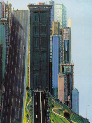
The class is called "About Style" and is about discovering your own unique style. We began by finding six paintings that we liked and examining them for common elements that might indicate our style preferences. From those, we chose one painting for a color study. I chose one of Wayne Thiebaud's San Francisco scenes. I was fascinated by his use of soft grays and cool colors and that shocking accent of lime and lemon.

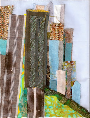
From that we were to find fabrics that might represent the color and feel of the piece. (I was working from a print which was much lighter than the Thiebaud above, so my values were off, but not quite as bad as it looks here.)

It was hugely challenging to find the right fabrics and I struggled not to resort to paint or to head to the store. It was valuable, though, to look at fabrics with a fresh eye and see how they might be used representationally. Pamela is big on working intuitively and asked us to complete each piece in less than 30 minutes, just gluing the parts down.
Next we took the same fabrics and switched the proportions of them, so I tried emphasizing what are only highlights in Thiebaud's painting:
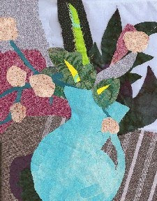
From the fabrics we were using, we constructed a simple still life, again working fast and intuitively and using scissors as our pencil to cut directly into fabric:
Pamela offered critiques of our color studies along the way to keep us on track, then a more extensive critique of the final exercise. She uses PaintShop Pro to clone our fabrics, or add her own if necessary, to SHOW us what improvements could be made and she explains WHY they help. Wow!!! So she changed my still life above to this:

And explained that the diagonal I had in the original chopped the picture too much. By curving out the table, she made more realistic planes. She moved my pale pink throughout to keep the eye moving, and put the darker rose behind it to make it pop. She added the shadow below to balance the darkness.
I am thrilled with this class! Now off to finish week 2 projects.
 I though I'd use my sketches as starting points, but once I began, I found it was a lot more fun to just browse through my fabric and let bits of it determine my plants:
 Our big project for the week was to put together a garden scene, paying close attention to composition. I was thinking of our gray spring days when bits of light shine through.
 I'm still pondering this one. I think a little more spark is necessary, so I've left this one on my wall for a while. I think I'm going to be compromising somewhere between my version and Pamela's.


