Showing posts with label Pamela Allen class. Show all posts

Monday, March 21, 2011

Wrapping up Pamela Allen class


I'm finally finishing up my lesson #3 from my Pamela Allen class. This one was about using stripes and patterns to accent design and also about steering away from pure bright color. It was a fun one, and a great wrestle with composition to work with so many bits, but I've pretty much decided that pictorial pieces are not my style.

Here's my first attempt. I was thinking about little Mexican villages that are these burst of color in the middle of drab surroundings. I wasn't trying to be very accurate, thus the peaked rooftops that you wouldn't find in Mexico.

Here is Pamela's revision. She recommended opening up the front for more space around the church and building a wall around it.


I made a number of changes and still see other things I would do differently (change the too busy house in the background, put the stained glass window shape back in), but I've lost my steam on this one and ready to move on.

Pamela is teaching more online classes this year and has now listed some on her website. I highly recommend them!

Over on Portland Art Collective, Tammy is giving away one of her beautiful Victorian tassel dolls, all dressed for spring. Leave a comment here to enter.

Sunday, March 6, 2011

Pamela Allen lesson #4

I'm still working on my lesson from week #3, so I'll post that later. Here's a little exercise we did from week 4. The focus for the week was on negative space, and we warmed up by doing a chair formed from the negative space. In other words I started with the tan and black lined fabric and cut the negative space from the colored fabric to form the chair.


It was very challenging even though I've done these sort of exercises in drawing already. I was so focused on getting the right shapes that I didn't give any thought to composition. Here're Pamela's suggestions to improve the composition of the piece:

My main problem was lining up fabrics right along the rungs or right with the seat line. And I always tend to crop closely while she allows more space around an object. I do like these changes she suggested.

The main part of this lesson was to do the same technique of using only negative space but now of a woman sitting in a chair. After one very dismal attempt, I decided it was way too tedious to try to rework, so I'm abandoning it and going back to work on lesson 3. I got the lesson of the importance of negative space, but can't say I enjoyed it.

Sunday, February 20, 2011

Pamela Allen exercises--part 2

Pamela gave us an alternative exercise for those who didn't want to venture into the complimentary color one. I needed more practice (and still do!) with composition, so I gave this one a quick try.

The assignment was to pick two colors and do a whole composition using only those, focusing on different values and intensities. The color didn't hang me up, but the composition did.

My thoughts here were that I wanted a big, bold contrast between the citrus and the blue bowl. I wanted it strong and graphic, yet anchored in a setting. I came up with this:


Pamela said the composition and scale made it visually confusing--the bowl is so much bigger than the chair, and the strong diagonal gives a strange perspective. Also the bowl is too big and cramped in the space, and there needs to be more variety in shapes to keep it interesting. Here is her revised version:

I do like the additional space she added. The bowl still really pops but is anchored much better in the space. And I really like how she kept the right half quiet, keeping all the emphasis on the bowl. She mixes up patterns, like putting the stripes of the floor in different directions to keep things interesting.

So now I'm struggling with how to do scenes that are not realistic, yet don't throw the viewer by being visually confusing. Not sure if pictorial pieces are ever going to be my thing, but it's a great learning experience!

For those of you who are interested in Pamela's classes. She only takes 20 in her class and has been teaching only one online class a year. Her classes fill immediately with return students, so there are seldom openings. But the good news is--she is considering repeating some of the classes more often during the year to allow in new students. If you are interested, email her at allen5@sympatico.ca

On another note, Stephanie is giving away one of her carved hearts over on the Portland Art Collective blog. Go here and leave a comment to enter. I have several of her carved pieces and love them!

Friday, February 18, 2011

Pamela Allen workshop

I am really thrilled to be taking another Pamela Allen online workshop this month. I got so much out of it last year that I couldn't resist another round, this one focusing on color and pattern.

We started by doing the same exercise we did last time, but since I wasn't hugely successful the first time, I was happy to have more practice. We chose a painter whose colors attract us, and then we tried to copy those colors in fabric.

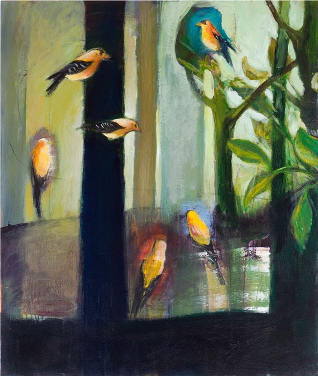
I chose this painting by my favorite Portland artist, William Park.


And my fabric version. I would have liked to have found a bit brighter, bluer green for the background, but this was as close as I had. It's a great challenge and teaches so much about putting together colors you might not naturally go to.

Next we take those colors and create our own small composition with them:

Pamela critiques each step of the way by photoshopping in changes she recommends. A fabulous way to see what works! My first exercise was fine. On this one she suggested a little more modeling with a few more pieces on the trees and mushrooms. I really like the added depth it gives to the mushrooms especially.

Our week 2 assignment was to take another painting we are drawn to and then recreate it in all its complimentary colors. I chose this Matisse:

Warning--this gets really ugly! The compliments make her look ghoulish. But I was really happy that Pamela said I had them all right. It's a huge challenge because you are not only thinking about color compliments, but also trying to find the correct values and intensities in that compliment. And translating from paint to fabric carries its own special challenges. A very worthwhile--but exhausting-- exercise!

You can see the exercises from last year here, here, here and here, and I'll be posting more as the class continues.

Saturday, March 13, 2010

Last Pamela Allen exercise

Finishing up my Pamela Allen class. The last exercise was to do a narrative piece. We started by critiquing artwork with a focus on how the artistic elements tell a story, even in something like a still life. Then we needed to come up with one of our own.

It was a very chaotic week for me, and I had just gotten a new book by Gail Godwin, a favorite author. I was marveling at how I could completely slip away from the chaos and lose myself in the book, and decided to try to make a piece capturing that.

I submitted 2 slightly different versions for critique.


I was afraid the first one was too overpowered by the flower background, so I tamed the background, but felt it lost something and became too static:


Pamela said she felt both pieces worked but conveyed slightly different feelings. She pointed out that the first, with the darker shading on the face created more anxiety and made the woman look like she was trying to read in the chaos, but finding it hard. The second was overall calmer.

There were strong opinions from the group on both sides about whether the flowers overpowered or not. I decided I wanted that overwhelming feeling, but created a bit of a corner to help her pop a bit.


It was a fun and challenging exercise, but I don't know that it's anything I'll continue with.

But I did love the class! Here's what I'm taking from it:
  1. I like Pamela's technique of cutting freeform and using a gluestick to anchor pieces. It's a great way to establish an overall composition before going on to details.
  2. I'm reminded to look to masters for lessons in composition and color.
  3. Think primarily about shape first and find ways to make shapes pop by varying the background.
  4. It's fabulous to find a great teacher to critique your work!!!
I highly recommend taking one of her classes!


Tuesday, March 2, 2010

Pamela Allen Exercises--week 3

Week 3 of my online Pamela Allen class was the grand cubism challenge. This was a tough one but a great way to wrestle with composition. We started by looking at cubist paintings. For our own pieces, we chose an object and fractured it in some way. Then tried to find its essence and add bits that picked up on that or on details in the object. And we were thinking again about creating contrast to make elements pop and working with positive and negative space.

My first attempt was close:

Pamela's only critique was that the additional fracture in the pitcher made it a little hard to read. I took that out and also decided I didn't like the white bits in that background fabric so switched to the polka dots:

For my second piece, I played with a fern shape:

Pamela thought the fabric in the upper left had too many busy lines, so I switched that out and do like this version better:


I felt like I was working on a giant puzzle this week. I'd get one area right, but then it would throw off something else. Frustrating at times, but I learned a ton.


Saturday, February 20, 2010

Pamela Allen Exercises--week 2

This week we focused on moving away from cliched plant images and coming up with our own. Pamela encouraged us to look at the work of masters, so I went through and sketched plant forms from 20c. art then doodled a couple pages of my own.


I though I'd use my sketches as starting points, but once I began, I found it was a lot more fun to just browse through my fabric and let bits of it determine my plants:


I then did a small study based on Paul Klee's plants:

Our big project for the week was to put together a garden scene, paying close attention to composition. I was thinking of our gray spring days when bits of light shine through.


Pamela suggested toning down my bright spots as they catch the eye too much. Here is her revision:

I'm still pondering this one. I think a little more spark is necessary, so I've left this one on my wall for a while. I think I'm going to be compromising somewhere between my version and Pamela's.

It was a fabulous week of composition instruction. It's been really fun to see all the gardens that people came up with, each with its own personality. I can't tell you how valuable it is to see Pamela's critiques of every piece!